
My work combines the traditional with the contemporary, the newest technologies with ageold craft techniques. I aim to create products with individual character by including craft elements in the industrial production process.
education & career
In 1993, after graduating at the Academy of Industrial Design in Eindhoven, I founded the Jongeriuslab studio, where independent projects, as well as works for major clients are developed, including textile designs for the upholstery fabric company Maharam, the interior design of the Delegates’ Lounge of the United Nations Headquarters in New York, cabin interiors for KLM Airlines, the installation ‘Colour Recipe Research’ at the invitation of curator Hans Ulrich Obrist for the MAK (Vienna) and the installation ‘A Search behind Appearances’, a cooperation with Louise Schouwenberg commissioned by Serpentine Galleries for La Rinascente during Milan Design Week 2016. Since 2007, I act as Art Director of colours and materials for Vitra.
design philosophy
My work combines the traditional with the contemporary, the newest technologies with age-old craft techniques. I aim to create products with individual character by including craft elements in the industrial production process.
I see my work as part of a never-ending process, and the same is essentially true of all Jongeriuslab designs: they possess the power of the final stage, while also communicating that they are part of something greater, with both a past and an uncertain future. The unfinished, the provisional, the possible – they reside in the attention to imperfections, traces of the creation process, and the revealed potential of materials and techniques. Through this working method, I not only celebrate the value of the process but also engages the viewer, the user, in my investigation.
Colour touches on so many different aspects of design: words, shapes, materials, physics, space, light. Experiencing colour is completely dependent on its physical, visual, artistic and cultural context. Therefore, colour is very subjective. It is different for every person, every surface, shape and under changing lighting conditions. This makes colour mysterious and ever-changing.
colour
Colour touches on so many different aspects of design: words, shapes, materials, physics, space, light. Experiencing colour is completely dependent on its physical, visual, artistic and cultural context. Therefore, colour is very subjective. It is different for every person, every surface, shape and under changing lighting conditions. This makes colour mysterious and ever-changing.
Beautiful colours for me are made with high-end pigments, which result in colours that breathe with light – taking on new hues under different lighting conditions. Through colour, I want to relate to the user, so the subjectivity of the colour experience is my starting point. I don’t want to educate people in colour harmony. My goal is to design colours that are made from high-quality recipes, which celebrate shape and surfaces. We aim at creating a new colour vocabulary, as a reaction to the flat globalized colour industry and above all to celebrate the full potential of colour.
relationship between color and material
Colour is a reflection in space. Objects absorb, reflect and resonate colour. Colour only becomes tangible on an object. The Greek philosophers considered colour as a physical property of an object rather than an optical phenomenon. Today, it seems impossible to approach colours in this way. We now perceive colours as a layer, coating, paint or skin of something, which can be changed at any time.
The coarse and dull colours, the smoothly polished colours and everything in between. Glass colours, watercolours, LCD colours, fabric colours… Colour has become material and material is colour. For me, there is no real distinction between a material and a colour. I’m sure physicists will disagree, but for me, colour and material have the same quality.
inspiring names & periods for color
In general, I find that colour designers are rather busy with psychology than with the actual world of colours – pigments and their limitations is the topic that interests me most in historical eras. The early Renaissance painters – Raphael and Michelangelo, or the Dutch painter Jan van Eyck – worked with a limited palette because there were not a lot of pigments available. With only seven or nine pigments they were able to mix large amounts of colours.
Masterpieces of art by Vermeer or Rembrandt are fascinating to me as well – especially because of their use of pigments and colours. They mixed paints, not colours – with natural pigments that were extracted from valuable ingredients from far away. The magic in these paintings arises from the richness and complexity of the used materials. The interesting part here is that I find that today’s industry offers only a limited palette of pigments for designers to use as well. To be clear: there are, of course, many colours available, but the used pigments on which this collection is based is limited. This industrial limitation takes away the quality and richness of the colour world we live in.
For me, there is no real distinction between a material and a colour. I’m sure physicists will disagree, but for me, colour and material have the same quality.
In terms of history on colour research: For one, it is the Bauhaus movement that inspires me. The Bauhaus design ideals are very similar to mine. Although my approach on how to reach these ideals is different, I still share the ambition to make high-quality products available for a large audience. This also applies to my work on colour in relationship to the Bauhaus. Here I also see a clash of two opposing views.
Josef Albers created a rich index of how colour can be designed. I still profit from this work. But it is the subjective aspect Bauhaus designers chose to neglect that interests me the most – not the final answers, but the questions trigger the journey we undertake to understand something. Another inspiring development was Le Corbusier’s use of colours. He was the first person to determine a subjective colour palette and develop a system especially for the effect colours can have on a space.
recent projects
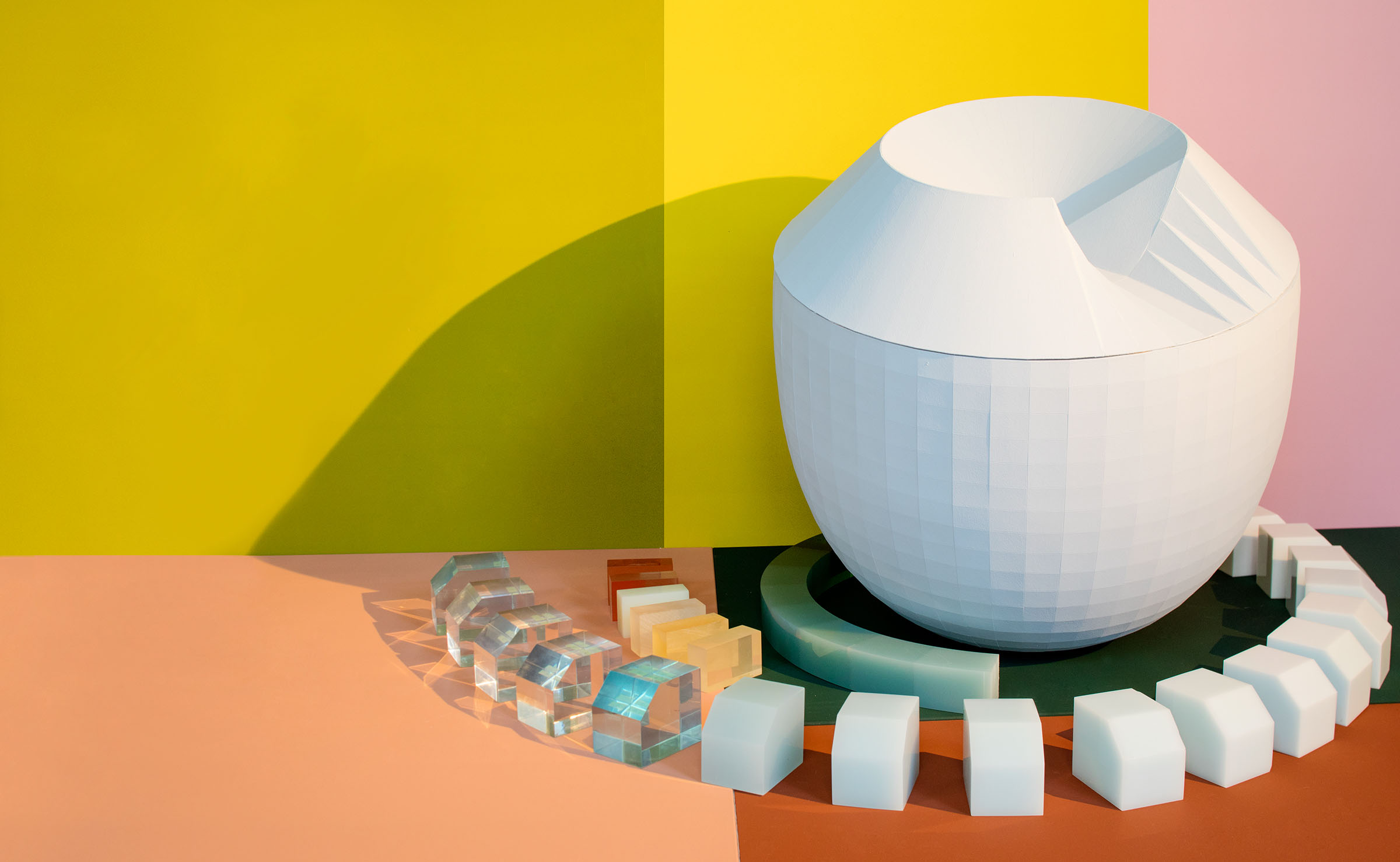
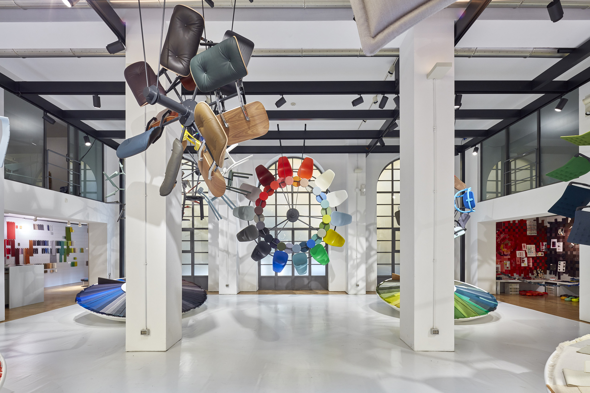
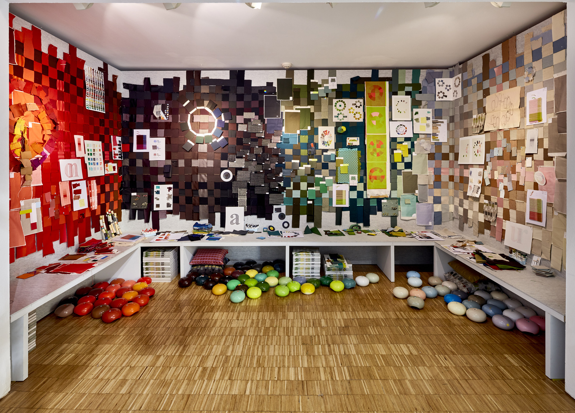
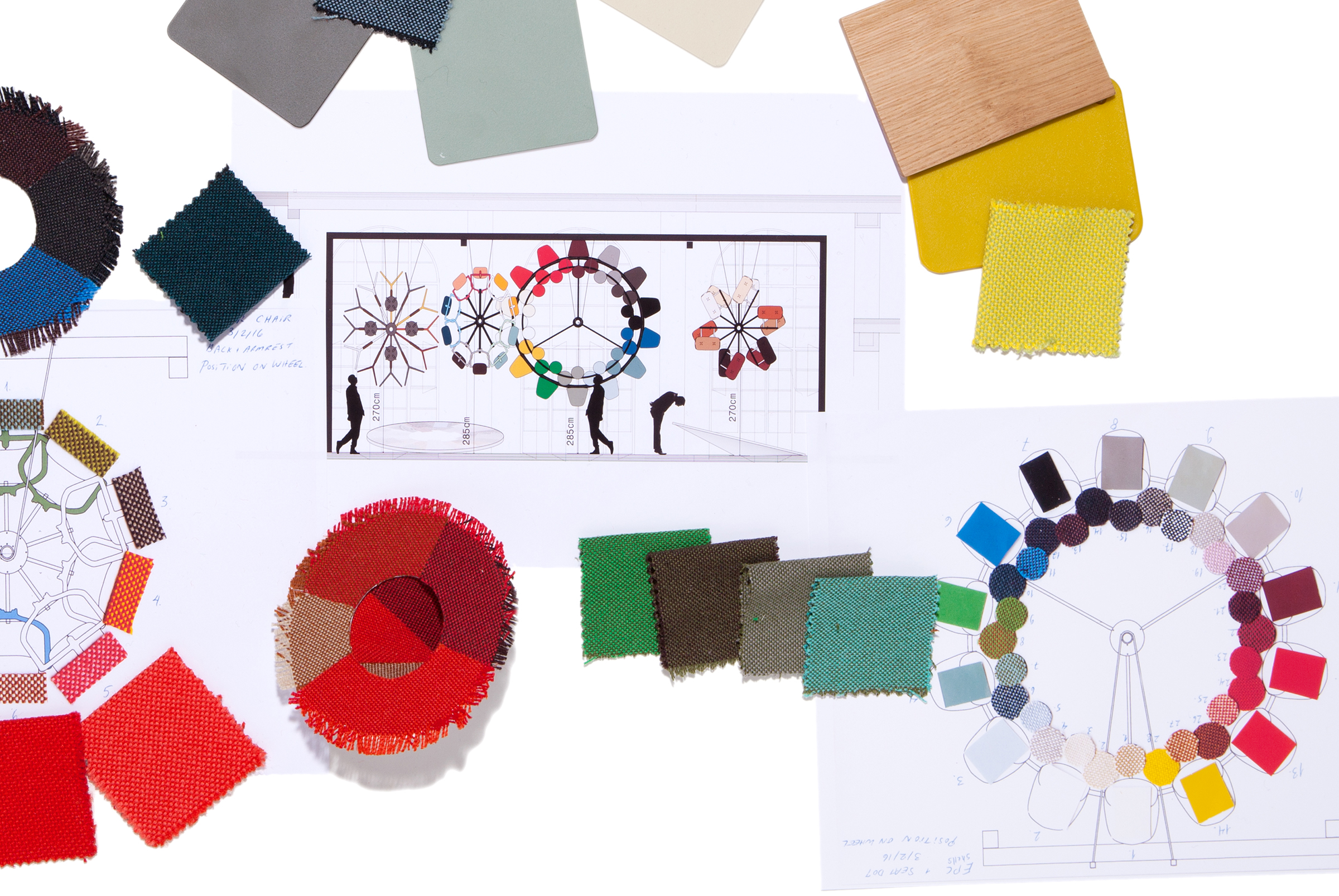
Breathing Colour is an installation-based show that takes a deeper look at the way colour behaves, exploring shapes, materials, shadows, and reflections. Through a series of studies and unique experiences the exhibition will make us question: How does the light during the day influence the colours and materials? What is the relationship between form and colour? When does a colour lift up a shape and give it a new dimension? What is the role of the shadow? All elemental aspects of design. The ultimate aim is to pit the power of colour against the power of form.
With this exhibition, we hope to build up an archive, create a tool for interpreting, tickle the eyes of the viewer, let the viewer see the breath of a colour, show a broader perspective behind the industrial palette, show how powerful a colour can be in taking over a shape, or even transform a shape and show all options that lie in the grammar of colour, as an on-going toolbox.
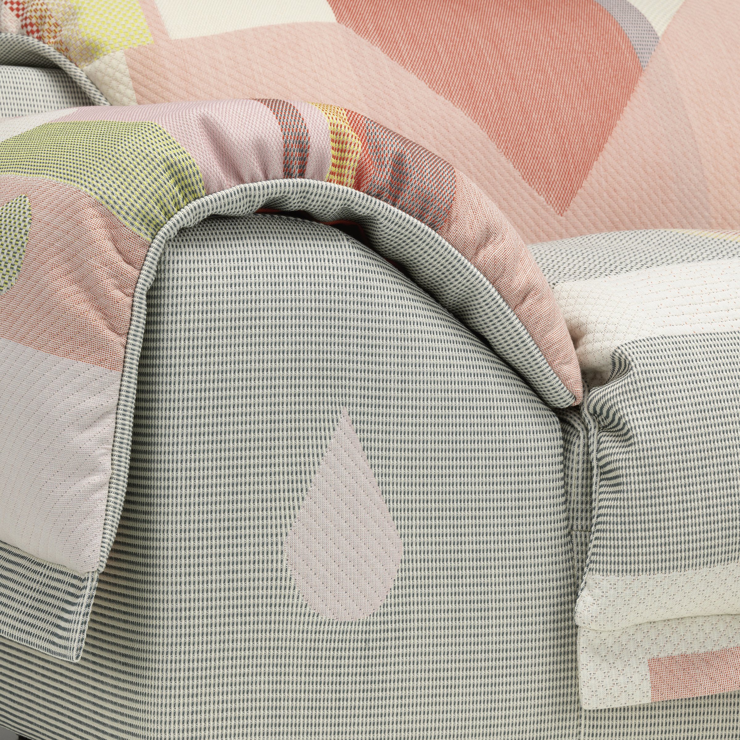
Another recent project is Vlinder. As a designer, I have to say, a sofa is a really difficult creature. It is a large object and very present when you enter a home. Also, it’s very difficult to innovate with sofas. There are so many sofa designs – you have to have a very good reason to make a new sofa. This puts the pressure on to find the right area to innovate in. Also, a sofa is a large object, so it shouldn’t be too loud, but on the other hand, you want to give it some signature. You can do that with textiles, so with Vlinder, I designed a sofa that is driven by textiles.
Vlinder has the archetypical shape of a contemporary sofa but its elaborate production and handcrafting transform it into a unique masterpiece. I was assisted by hand weavers and a team of textile engineers, who all joined forces to make this novel design possible. Vlinder embodies a new kind of tailored ‘oneoff’ pattern, an haute couture sofa that combines the human touch of crafts with the possibilities of digital technology. In addition to the outstanding cover, the sofa offers ultimate comfort due to the soft padding made of multi-layered foam, in combination with the pillow-like blanket. The most prominent feature of the sofa is its cover: a large-patterned overlay in a soft jacquard weave – called ‘Tailored Fabric’ – which is draped over the sofa body. This fabric is a textile construction in which the position of different weaves is tailored to the shape of the sofa for a unique appearance. The result is a collage of intertwined textures and colours, reminiscent of historical tapestries or Gobelins, blurring the border between utilitarian object and art. The elaborately produced fabric is draped over the seat, back and armrests of Vlinder.